I’ve been a bit quiet lately—and that’s because I’ve been cooking up something really exciting.
I’m not quite ready to share it yet (soon!), but it’s a project I’ve wanted to do for a long time, and I can’t wait to bring you into the fold when the time’s right.
Meanwhile, here are a few things that happened on my end:
While I’ve been heads down, there’s one topic I keep coming back to: retention.
Not retention as a one-off number.
Not “how many people stayed this month.”
But rather, retention as a story that unfolds over time.
So many organizations look at retention as a single number or a series of dots on the plot, forgetting about a broader trend in retention in the context of what is happening at the company.
So, in this issue, let’s explore the different ways of looking at retention as a trend and how you can level up your team's thinking about it.
Let's start with thinking what a trend is:
Trend = the overall direction of change over time.
Going one step further, think of a trend like momentum in sports or fitness:
A single great game or workout doesn’t mean much, but a string of them?
That’s a trend.
That’s momentum. And, momentum builds momentum.
In people data, trends help you move beyond snapshots.
They show whether your retention, engagement, or hiring effectiveness is building energy or losing it, allowing you to navigate your environment strategically.
In today's newsletter, we will explore trends in retention as:
Simple dots on the plot
Linear model
Moving average
Exponential Moving Average
📊 Simple Dots on the Plot
Plotting raw retention over time gives you a sense of the monthly ups and downs.
It’s messy. It’s real. It's well, raw.
It also helps spot spikes or drops when something significant happens (like a reorg or a new comp plan).
Why it’s useful: You see what actually happened—no smoothing, no guesswork.
The challenge: It’s noisy. It’s hard to tell whether that dip is a trend or a blip.
📈 Linear Trendline
Next, try adding a linear trendline. It’s a straight line that best fits your retention data over time.
Adding the line to the image shows the overall retention trend for lower values, despite occasional spikes and nose dives.
Why it’s useful: It tells you the overall direction—are things getting better or worse?
The challenge: Real-world data rarely moves in a straight line. So this oversimplifies it.
📉 Moving Average
Want a better picture of what’s happening without getting lost in the noise? Use a moving average.
A 4-month moving average (in the image) smooths out short-term fluctuations, showing a more stable retention trend that has gone lower and stabilized over the last several months.
Why it’s useful: You can see whether retention is improving or just swinging wildly monthly.
The challenge: You lose visibility into sudden spikes or drops; however, if you keep the raw data on the graph, you should be able to see these too.
Note also that I am using a 4-month moving average here as that's about the amount of time someone needs to find a new job after they decide they are ready to quit.
However, this is an assumption I am making for the purposes of illustration. You might consider a method that makes logical sense to you.
📈 Exponential Moving Average (EMA)
Now we’re getting fancy.
The exponential moving average is like the regular moving average but gives more weight to recent data.
That makes it more responsive to recent changes than historical changes—you can see how the dive at the last observation was much more pronounced.
Why it’s useful: It balances noise reduction with responsiveness—great for catching emerging trends early.
The challenge: It’s a bit more complex to explain. But worth it. Also, you probably will need to code this into your tool manually (the rest are easily available in your standard spreadsheet software).
If you want to get even fancier, check out TRAMA (Trend Regularity Adaptive Moving Average), which is similar to EMA but reduces the noise even further due to a double smoothing factor.
Why does this matter? You might ask...
Retention isn’t just a KPI.
It’s a signal.
And how you visualize it determines how well you can act on it.
If your team still uses static snapshots or annual averages, now’s a great time to experiment with moving averages or exponential smoothing.
It’s a small shift that can provide much clearer insight into how your people are doing and where things might be heading.
And don't just look at retention.
Check out how it works on other measures like attendance, engagement, and productivity.
You will be amazed by the insights you uncover.
That's all for now.
Till next time!
K
Whenever you’re ready, there are 2 ways I can help you:
#1
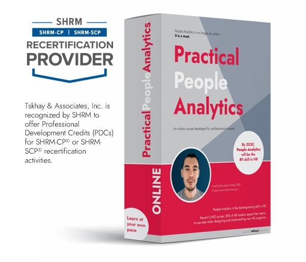
If you’re still looking to get started in People Analytics, I recommend starting with my affordable course:
Practical People Analytics: Build data-driven HR programs to 10x your professional effectiveness, business impact, and career. This comprehensive course will teach you everything from building an HR dashboard for business results to driving growth through more advanced analytics (i.e., regression). Join your peers today!
#2
If you are looking for support in your human capital programs, such as engagement, retention, and compensation & benefits, and want to take a more data-driven approach, contact me at Tskhay & Associates for consulting services. Or simply reply to this email!
by Konstantin Tskhay June 4th, 2025 People Analytics Just Got 1,700x Faster (No, That’s Not a Typo) ↓ Hi again, friends! 👋 Before we get into the meaty stuff, a few quick hits: 🎓 Join the Toronto People Analytics GroupOur Toronto meetup crew is growing fast (554 people already). If you want to connect with like-minded individuals who love HR data and people analytics, this is the place. We just wrapped a 🔥 session with Richard Rosenow and are cooking up the next one for fall. 👉 Join here! 🏢...
by Konstantin Tskhay May 21, 2025 Extreme Ownership for People Analytics Leaders ↓ Hi again, friends! 👋 A few quick updates before we dive in: 🎓 Join the TORONTO PEOPLE ANALYTICS GROUPAs you know, I am one of the co-founders of the Toronto People Analytics Group. A meet up space for us to connect, learn from each other, and have a good time. Please join if you are interested in people analytics and strategic HR. We are about to release the next event sign up and trust me, you don't want to...
by Konstantin Tskhay May 14, 2025 Survey Says… Not So Fast ↓ Hi again, friends! 👋 A few quick updates before we dive in: 🎓 Teaching at TMUWe’re now deep into the Toronto Metropolitan University’s People Analytics Program that I developed—and the students are incredible. This week, we’re diving into data collection, and the class inspires this newsletter. 🏢 Got space?The Toronto People Analytics Group is still looking for a space sponsor for our upcoming meetups. If your org has a cool office...